VARIOUS PROJECTS
| ATLANTIC RECORDS
Atlantic Records is one of the most personally influential companies I've had the pleasure of working with between the camaraderie of my peers in the super-talented design team and being at the forefront of the cultural and technological zeitgeist as a result of the conflation between revolutionary happenings in the world of the music business in terms of content distribution/audience engagement, and the deepening relationship between society and technology on the heels of the advent of the emerging ubiquity of the smartphone.
The internet and its users expectations have evolved considerably since the era the work below was conceived, however I am proud of these efforts and to have been among the pantheon of incredible designers and thinkers that have participated in the evolution of how we reach the masses. So I say to my precious designs in the immortal words of Atlantic Records royalty Bruno Mars, "you're amazing, just the way you are"! Enjoy!
DESIGN + ANIMATION Ian S. Foster


GENERAL WORK
In the era when album art was still king, working as a web designer at Atlantic Records often brought forth challenges in translating visual elements into a space some design considerations were not accounted for. The examples below represent my most valiant and successful solutions in that regard for a handful of artists on the label.
In the case of reggae superstar Sean Paul, his then latest album cover was designed by a relative who might not have considered how far the aesthetic was meant to be leveraged as far as brand presence on the internet was concerned. My design of his website integrated the colors and tones of the album cover and evolved the overall look to establish a brand identity that was bit more accessible to a mass audience in both aesthetics and usability.
For Ricky Blaze, I crafted a graffiti/urban inspired design mixed with light, tropical tones and colors evocative of his Jamaican heritage and reggae musical roots. It was an experiment in changing the conventions of site navigation and social media link styles in our existing framework which I had to work closely with the developers to resolve, but ultimately resulted in a visual solution that properly reflects the fun/party vibe of the overall page design, and by extension, Ricky's music.
New Medicine was a cool band signed to Atlantic Records that enjoyed a 90s-style grunge aesthetic and sound. I designed an original look for their online brand that wasn't predicated by any album cover designs and their first site on the Atlantic Record's framework. I had quite some fun exploring a look and feel with this one without limits!
Leading up to the release of her debut album, Wynter Gordon was in need of a strong web presence to compliment the impending event. However perhaps in reflection of her fashionista background, her personal design preferences were broad, lacking any definitive direction. After several initial explorations that were feeling a bit too "digital", I was encouraged to take a fresh, more timeless approach and incorporate mixed media. Below features a sampling of the strongest iterations I crafted in this effort, contrasting a bright and "poppy" option with bit of an edge, with another boasting a dark/moody sophistication through relative simplicity.


Original website header design
SKILLET
Skillet is a band whose aesthetic proclivity toward technological/futuristic shape accents, gritty textures, and dark colors contrasted with bright, neon lights aligned with my personal design proclivities in this era more than any other artist on the label. This was a major re-branding effort that proved a bit challenging, as most of Skillet's previous visual presence on the internet was Flash-heavy, and I was tasked to maintain the visual energy of those sites, limited within our more modern (in 2011 at the dawn of responsive web design), but less motion-intensive framework at Atlantic Records.

ALTERNATE HEADER STYLE

ORIGINAL HEADER ANIMATION - SANS TEXUTRED BACKGROUND

Alternate Home Page Design

Interior Page Design

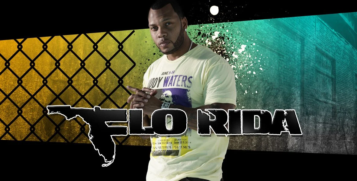
FLO RIDA
The premier forerunner of club/party rap in the modern pop music era,
Flo Rida was looking for an aesthetic revamp of his brand that reflected his Miami origins and roots as a grittier urban musical artist. These were attempts to subvert the aesthetic pastels and art deco shapes that film auteur Michael Mann codified with his watershed 80s TV hit Miami Vice that defined the look of an era, but did not reflect a visual reality that Flo knew growing up in his corner of the city.